InTaVia’s second newsletter is a report on the latest developments of the InTaVia’s platform including its frontend components for the visual curation, analysis and communication of cultural information. While cultural and historical data as well as several (national) biographical databases and object databases have become widely available across Europe, some limitations—especially the absence of usable tools and missing links between national databases—prevent their exploitation for historical research. InTaVia aims to overcome these limitations (1) by linking these siloed databases and (2) by designing an intuitive interface for the resulting knowledge graph. As we reached Milestone 3 of the InTaVia project (“Basic Operational System”) we documented the status of InTaVia’s transnational knowledge graph and its operational frontend components, including visualization and text mining technologies. With this in mind, in this newsletter we reflected upon
- the advanced design phase,
- the developments in the work packages on the Visual Analytics Studio (VA studio), the Visual Storytelling Suite (ST suite) and the Data Integration & Curation with a newly created bridging module, called Data Curation Lab (DC lab),
- the state of cross-cutting topics and technology context,
- an outlook to upcoming development and evaluation stages of the project roadmap.
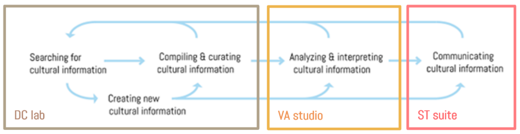
Figure 1: The envisioned non-linear and iterative workflow of InTaVia users (searching, creating, compiling & curating, analyzing, and communicating data) aligned with the three frontend top-level components.
Following the intended InTaVia workflow which includes activities of searching, creating, or curating cultural heritage data, but also analysing and communicating such information visually (see Figure 1) we describe the developments and progress of the three top-level frontend components:
- Data Curation Lab (DC lab)
searching, creating, compiling & curating > Search, Visual Query - Visual Analytics Studio (VA studio)
analysing & interpreting > Visual Query, Timeline, Map, Coordinated View - Visual Storytelling Suite (ST suite)
communicating > Story Creator
How to Catch Data and Make a Matrix of Visualization Options
In several design sessions of the InTaVia consortium, a data visualization building kit was created (Figure 2), which was used to explore and play with various options how to combine multiple views on various constellations of InTaVia data. In this way, an entire matrix of visualization options emerged that can serve as a more systematic consideration for dealing with the complex design space for cultural-historical data analysis based on biography and object data (Table 1).
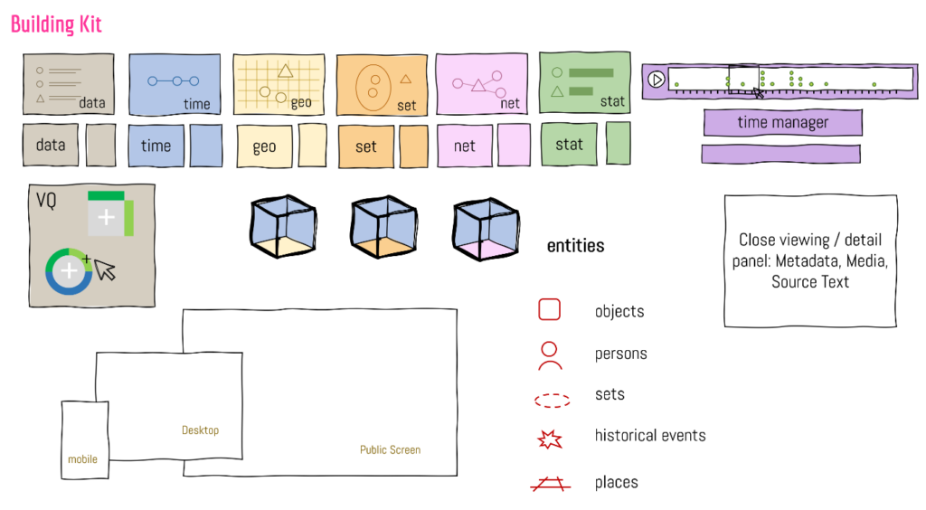
Figure 2: A combinatorial construction kit for sketching and conceptualizing task-tailored data views with pre-defined, data-specific building blocks – as used during the design phase.
During the design sessions, an initial set of task-tailored views was assembled to prioritize development objectives for Milestone 3. As a result, the initial implementation phase focused on establishing the essential timeline views in their interconnection with map-based views. Network- and set-based views will be part of the developments leading to the next milestones, along with visualization of data quality and data provenance.
The visualization design space (see Table 1) document show these task-tailored views will be available for various combinations in the flexible coordinated view system of the VA studio, that will allow users to explore object and biography data selections (i.e., from individual objects to collections and from individuals to prosopographic composites) from multiple analytic perspectives (e.g., in their geographic, relational, categorical, statistical, or temporal contexts).
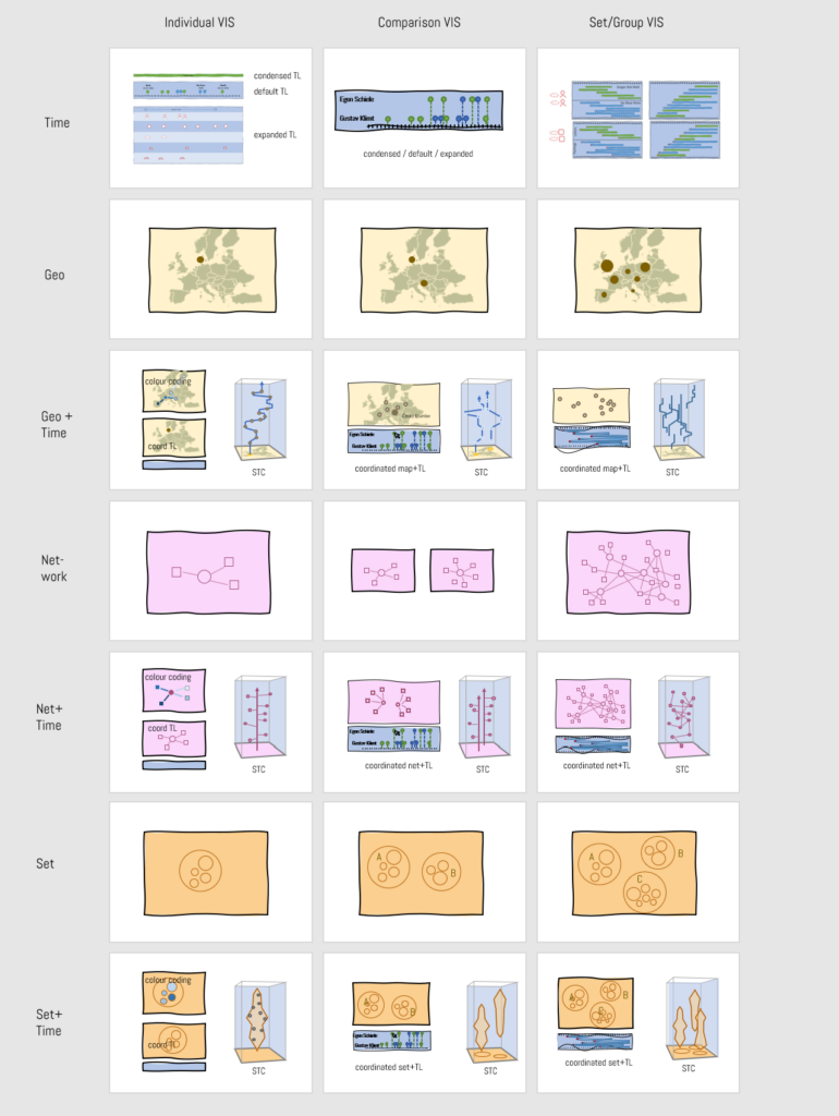
Table 1: A matrix of InTaVia visualization options
Multiple views (e.g., a map and a timeline, two maps) can be coordinated through various interactions techniques, including brushing and highlighting interactions, synchronized scrolling, panning, and zooming, or explicit visual linking. The InTaVia prototype will implement the first two options. Time and space can be encoded in multiple views (e.g., with a coordinated map and timeline) or in a single view, for example by using color-coded trajectories or animation to convey time, or to represent both aspects in a space-time cube (Figure 3).
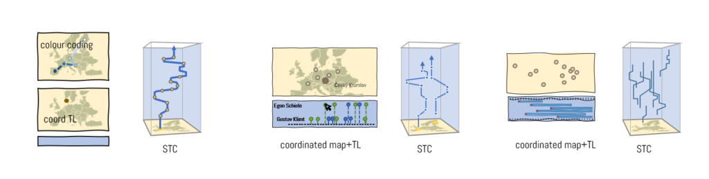
Figure 3: Options to visualize spatial and temporal aspects of biography (left) and prosopography data (centre, right) in an integrated fashion in InTaVia’s VA studio.
Are you curious yet? The current prototype implements a first version of the coordinated view system (see the screenshot in Figure 4), for which it combines a maximum of three different views on a single page.
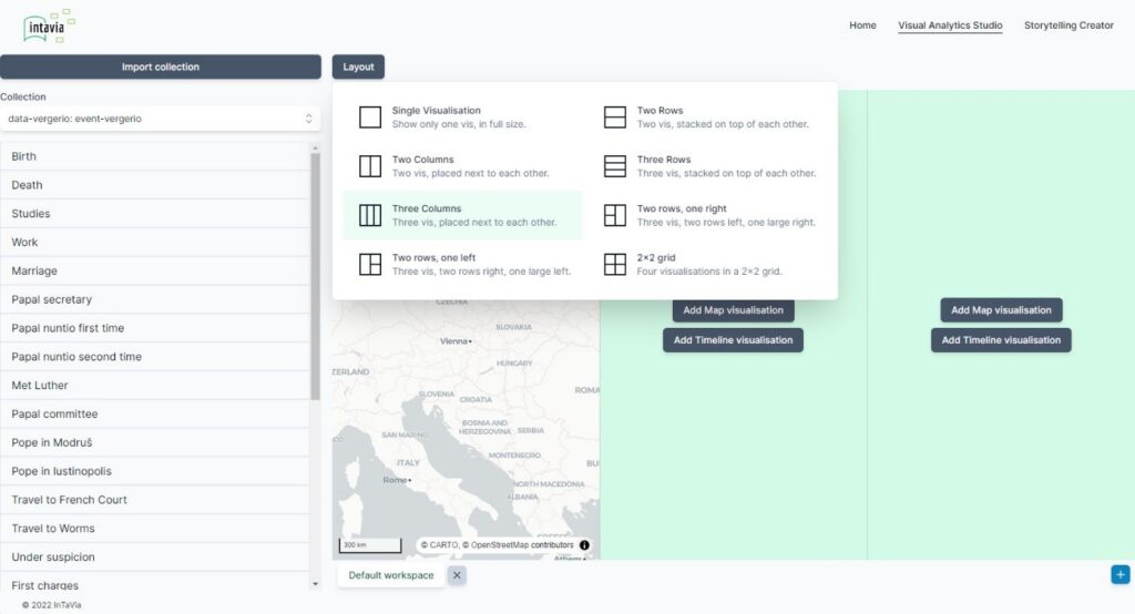
Figure 4: Screenshot: maximum of three different views on a single page.
Develop Visual Query and Visual Text Mining Support
Many complex query options depend on the users’ prior knowledge of the complex query language and database structure, which would make it difficult for non-technical users (the major part of InTaVia users) to perform advanced searches in InTaVia’s complex, multidimensional knowledge graph. In addition to faceted search, where results are narrowed down by a combination of multiple facets and filters, InTaVia will provide options to search via visually created queries (e.g., by the means of “scented widgets”) in an intuitive and easy-to-learn way (Figure 5). Visual queries allow experts to create meaningful and complex queries, while allowing less experienced users to search the extensive InTaVia knowledge graph.
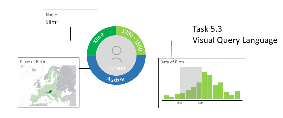
Figure 5: Conceptual options for visual data query support.
On the side of data creation, visualization support for document annotation and text mining will help users without strong natural language processing (NLP) skills to analyze annotation differences and review, evaluate, and correct the results of various algorithmic solutions. In addition to annoXplorer (a tool that can handle long source texts and bear annotations on similar orders of magnitude, multiple, possibly conflicting sources, and contain multiple tags) approach, we have developed the “Performancer” approach (working title), which provides a model-agnostic overview of annotation data at the level of whole text corpora. It enables the analysis and comparison of the performance of different annotation methods, which can range from manual annotations to the output of state-of-the-art natural language models.
Cultural Heritage Storytelling – How are stories created?
At the end of many workflows of working with cultural data we find activities of communicating data or telling stories about them (Fig. 1). At the heart of InTaVia’s “Storytelling Suite” is a story creator with a slide editor, where users define the visual outcome of each story’s building blocks with editing slides (see Figure 6). The story flow panel at the bottom controls the order and flow of the various story slides, database entities are listed on the left, and multimedia slide content is provided on the right side of the layout.
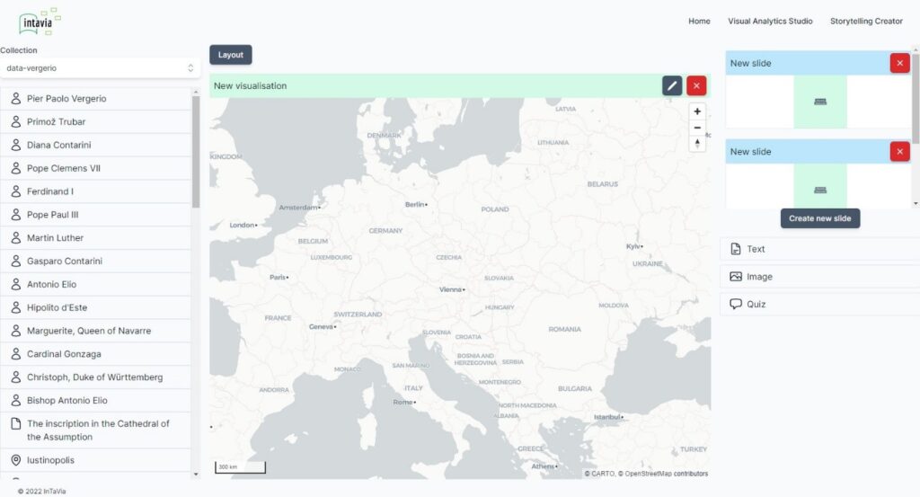
Figure 6: A screenshot of the “story editor” within InTaVia’s Storytelling Suite.
As soon as a story about historical persons or collections has been created, it will become available in the so called “story viewer” of the InTaVia platform. This component will provide a simplified user interface for the consumption of data stories with an emphasis on casual users and their “joy of use”. As such, it will allow to click and zoom through stories on both desktop or mobile devices, but also to solve engaging puzzles and quizzes in between (Figure 7).
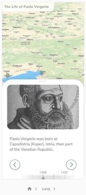
Figure 7: Prototype of the InTaVia “story viewer” with a case study of Pier Paolo Vergerio.
The overall prototype development was guided by the aims defined for Milestone 3 – a “basic operational prototype with connectivity partially established and ready for evaluation.” Currently, the prototype implements all outlined features in a partly connected manner and it is undergoing a first round of user testing. Using sample data of place, object and person entities with attributes (e.g., name, gender, occupation) and life events (e.g., birth, residence, death), users can search, review, and edit data in a data view (DC lab). Searches are possible with a keyword search or visual queries. The queried person data can be visualized with a timeline or a map view, which can also be combined as coordinated views, together with a person entity list (VA studio). Additionally, the ST creator implements a basic interactive interface to generate or import visualization-based stories as interactive slideshows.
Looking at this major milestone, there is still quite a way to go … But we are excited to do it!
And we have you as a potential user in mind as we do so, as the evaluation will bring together many questions and answers about different types of cultural data and user practices:
Identify user practices:
Which user practices do InTaVia users engage in?
How can the platform expand these processes or enable new ones?
Identify usability issues:
What bugs and interaction problems are observed?
What misconceptions and inconsistencies are experienced by the users?
Evaluate the VA studio and other InTaVia components:
How does the VA studio support or impede user practices?
Which insights are enabled? Which mental models constructed?
Are further views needed?
Are you interested in testing out the outlined components and methods? We would be delighted to see you at one of the upcoming workshops or work with you on (your) cultural heritage data and include your feedback and requirements as a “case study patron”! Please do not hesitate to reach out to us via intavia@donau-uni.ac.at.